LARK Restaurant Re-imagining
“Everyone loves what you’ve done with our restaurant. Thank you!”
– M. Liberson, founder.
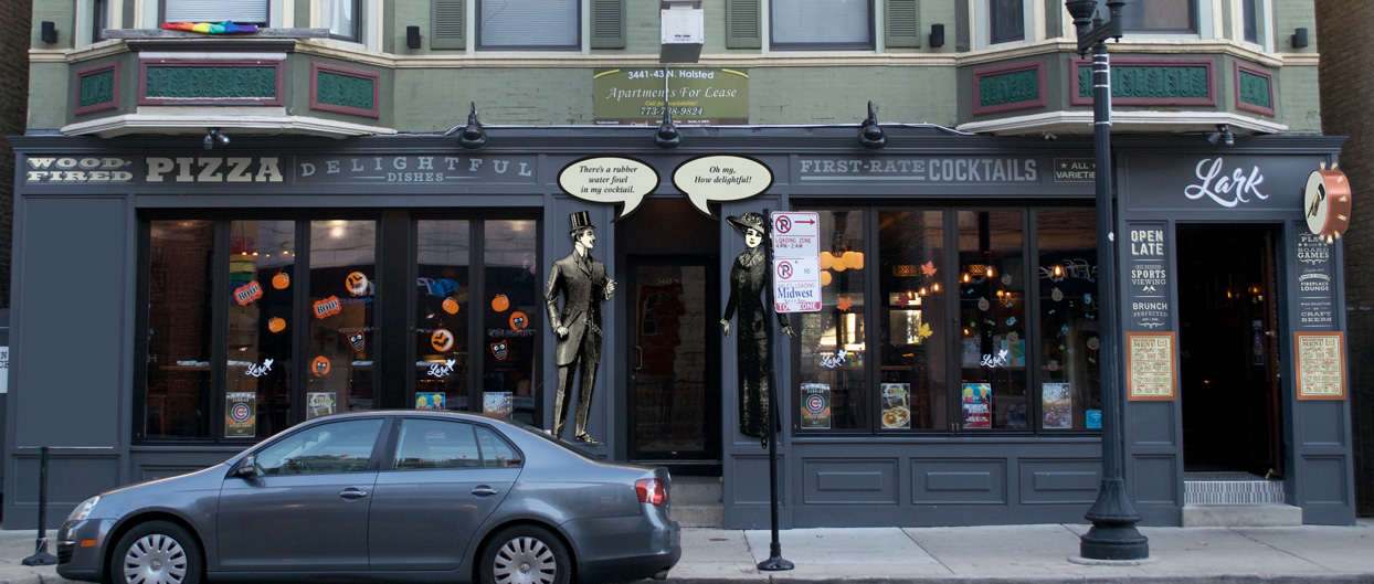
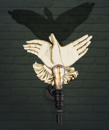
in 2016 we were asked to help newly opened restaurant Lark with it’s image. Specifially, the client thought the restaurant wasn’t fun enough. The bar/restaurant had brought in retro board games, and has a spirited staff, but otherwise looked a bit generic. Most of the decor and furnishings had come from an Irish pub, so there was a volume of unrelated framed items further diluting the space. The strongest visuals for me were the turn-of-the-century style light fixtures, wallpaper, and woodwork. I suggested an amplification of the turn-of-the-century aesthetic with an almost Monty Python influence, and featuring avian elements to strengthen the concept of their name and blended with pop-culture elements. I focused limited resources on areas that we identified as having the greatest impact on both attracting and engaging patrons. We began with the facade, followed by the interiors, the patio and lastly the menu.
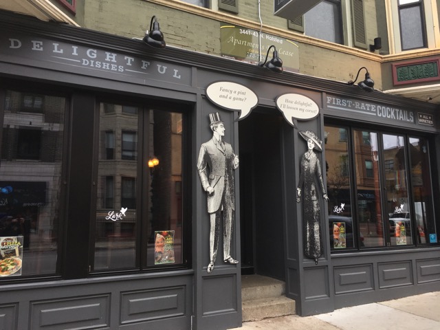
The characters added to the facade have word bubbles with removeable type, designed to be updated on occasion.
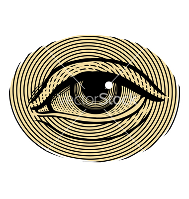
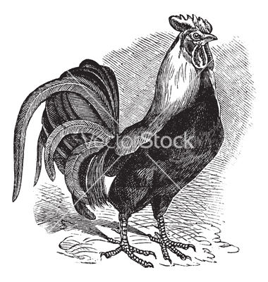
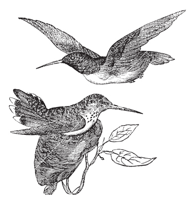
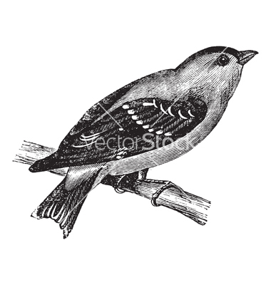
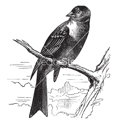
Put a bird on it. As a cost effective and relatively quick upgrade, We suggested swapping the hodgepodge of framed items taken from an Irish bar, with new artwork featuring a variety of birds, bringing the Lark icon inside and strengthening the brand overall. Bolder and more thematic images…vintage and a bit quirky… really helped to create a more clear identity for the restaurant.
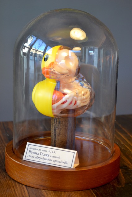
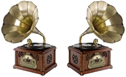
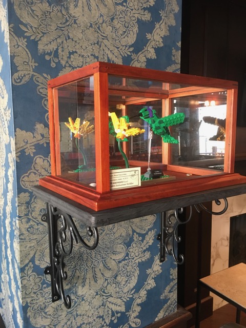

A variety of physical props were suggested to complement the updated framed pieces. Custom vintage museum displays of Lego birds and an anatomical model of a rubbery ducky reinforced the playful combination of turn-of-the-century and pop-culture references, or even suggested a cocktail. Dual gramophones were suggested additions to a DJ setup.
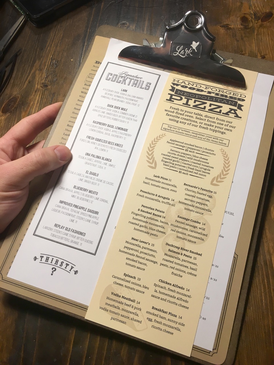
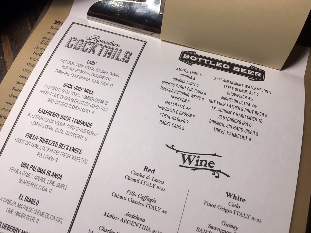
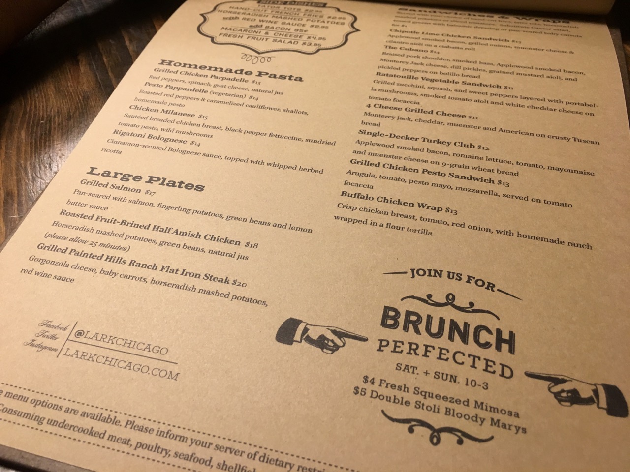
As a key interactive element for all patrons, the menu needed a major overhaul from both an organizational standpoint and to emphasize both the updated visual concept and highlight menu features. A major component of Lark are it’s wood-fired pizzas, which were lost in both the menu and the restaurant. The clipboard concept with multiple papers and sizes, though more complicated in execution, elevated the dining experience, food quality perception, is easier for patrons to navigate and finally gave their pizzas proper attention. A Brunch menu was in the works, designed to resemble “the morning newspaper”.
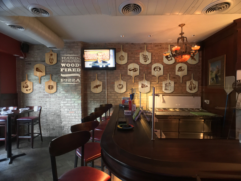
Lark’s wood-burning oven occupies a smaller space off the main dining area and offered little charm. In an effort to both elevate their wood-fired pizzas and create a dining space that didn’t feel like you were being sequestered, all of the updated framed elements related to pizza and we added a wall of custom laser-engraved wood pizza peels featuring toppings and hand-painted typography on the brick.
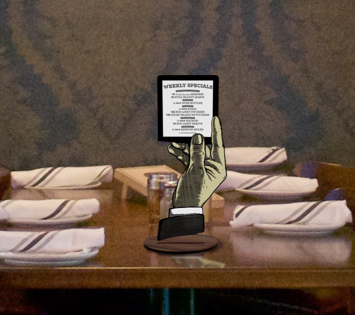
Lark suffered from an overload of menu information provided to patrons which resulted in a jumbled mess of overlooked information at the table. A custom “table-tent” replacement was designed to both highlight weekly specials while further enhancing the vintage-whimsical design elements.