– M. Liberson, founding partner.
LARK Restaurant Re-imagining
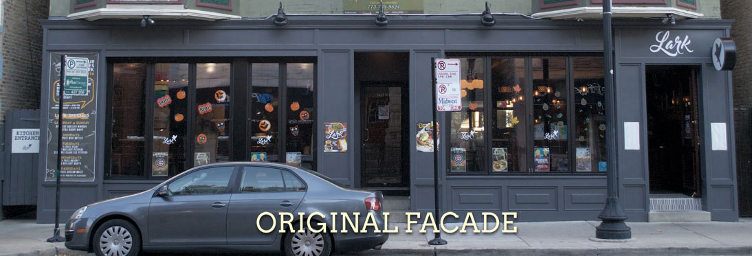
Lark’s exterior had a host of issues. While the simple gray panelling was attractive, it failed to express any relevant or compelling information about what you could expect to find inside. Worse, the blank slate became covered by an onslaught of cheap postings. Their logo and signs did not reflect the more laid back and fun experience the owners were aiming for.
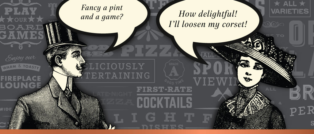
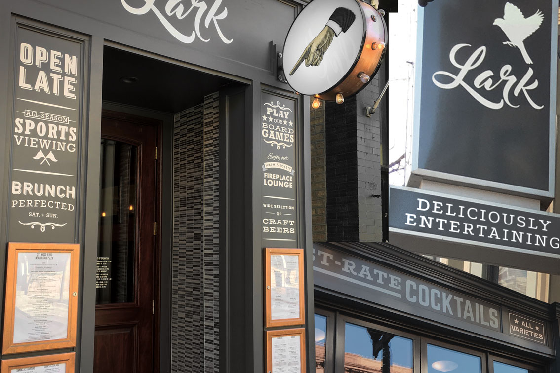
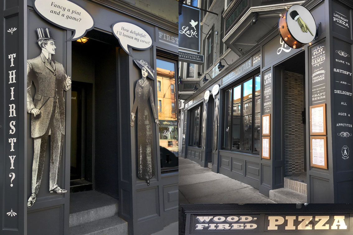
Large sign faces can be expensive and changing the name or logo of a restaurant isn’t simple. Our suggestion was to add a variety of hand-painted typography elements to add character and information. Two vintage illustrated characters were added to the center of the facade and featured word bubbles with removable type for a whimsical and informative exchange that can be swapped as often as desired. The Lark bird icon sign over the entrance was rebuilt with copper finishes, chasing lights and a pointing hand, inspired by a vintage arcade device and directing curious patrons to enter. Sign faces were created to replace the bland “DRINKS & DINING” sign with a more targeted and fun description of “DELICIOUSLY ENTERTAINING”. Menus and specials now have a home in permanent outdoor frames to prevent posters from littering the windows and facade.
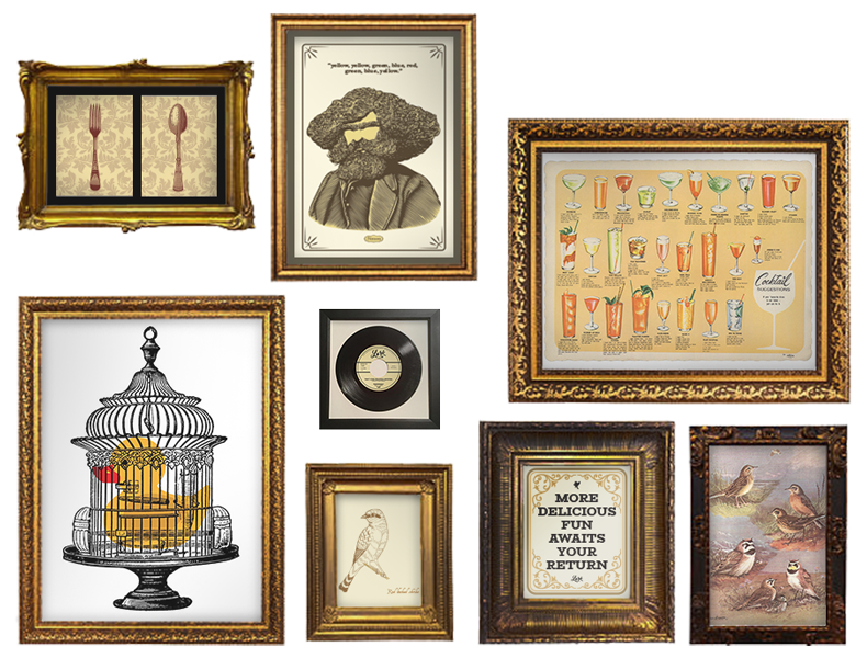
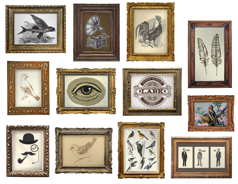
Put a bird on it. As a cost effective and relatively quick upgrade, we suggested swapping the hodgepodge of framed items taken from an Irish bar, with new artwork featuring a variety of bird references, strengthening the existing logo and the overall concepts. Bolder and more thematic images…vintage and a bit quirky… really helped to create a more clear identity for the restaurant. Dimensional display elements enhanced these concepts.
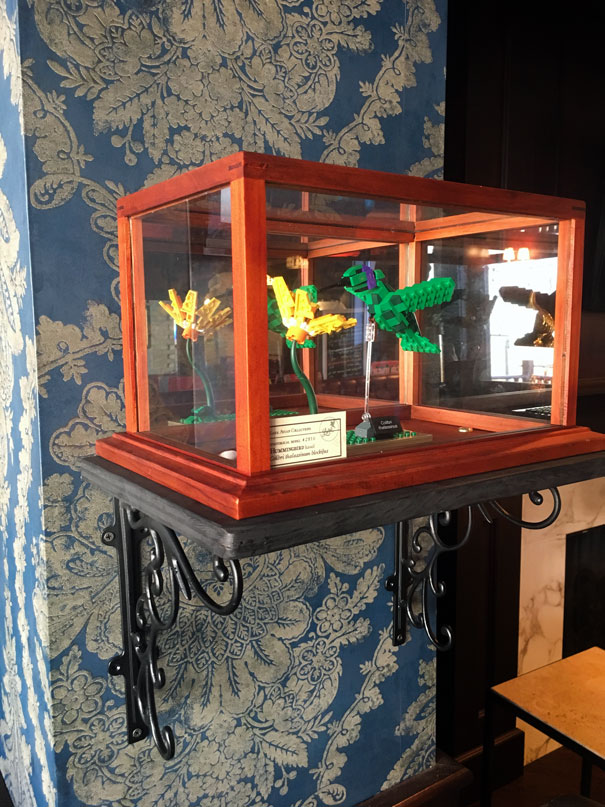
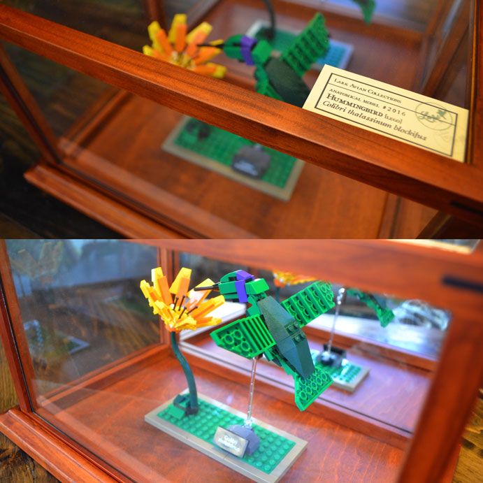
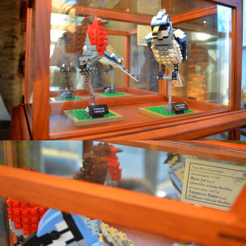
Museum displays of (LEGO) avian species perfectly embody our whimsical vintage/pop-culture mashup.


This unusual, interactive display features a scientific, bisected rubber ducky model advertising Lark’s Duck Duck Mule.
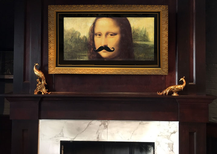
Fancy golden birds and a framed video display above the fireplace featuring a loop of whimsically altered art.
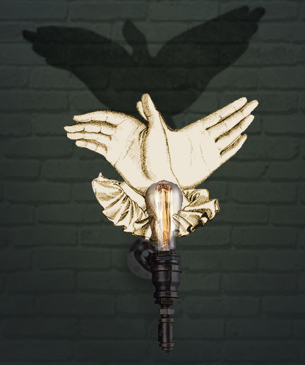
An original hand-shadow puppet sconce.
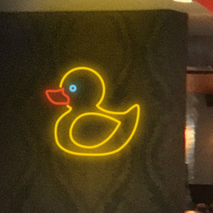
Another rubber duck, in neon form.
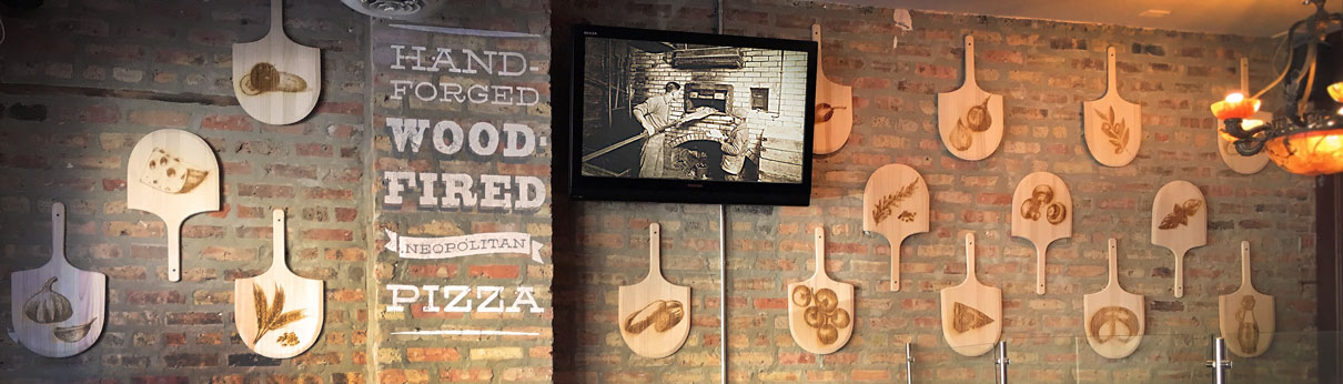
Lark’s wood burning pizza oven is located in a side room which lacked any charm and made guests feel as though they were being sequestered to an over-flow space past the bathrooms. We changed all the room’s art to feature pizza related subjects. An installation of laser-engraved woden pizza peels and hand-painted typography on the brick wall created a space centered on the featured food.
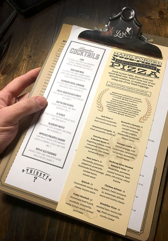
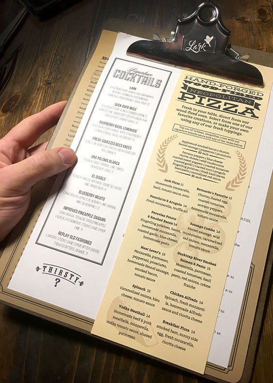
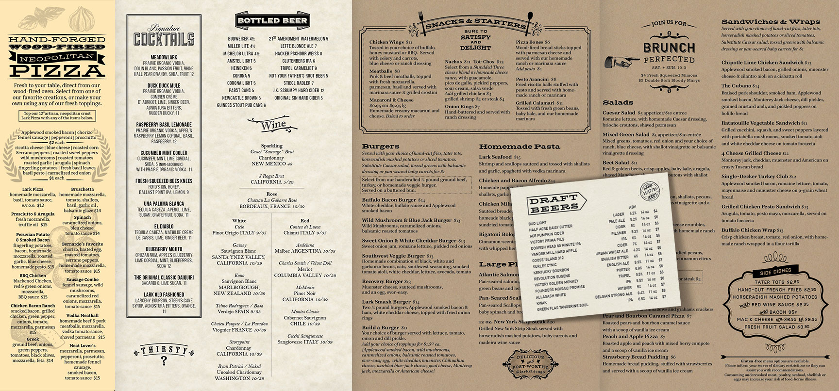
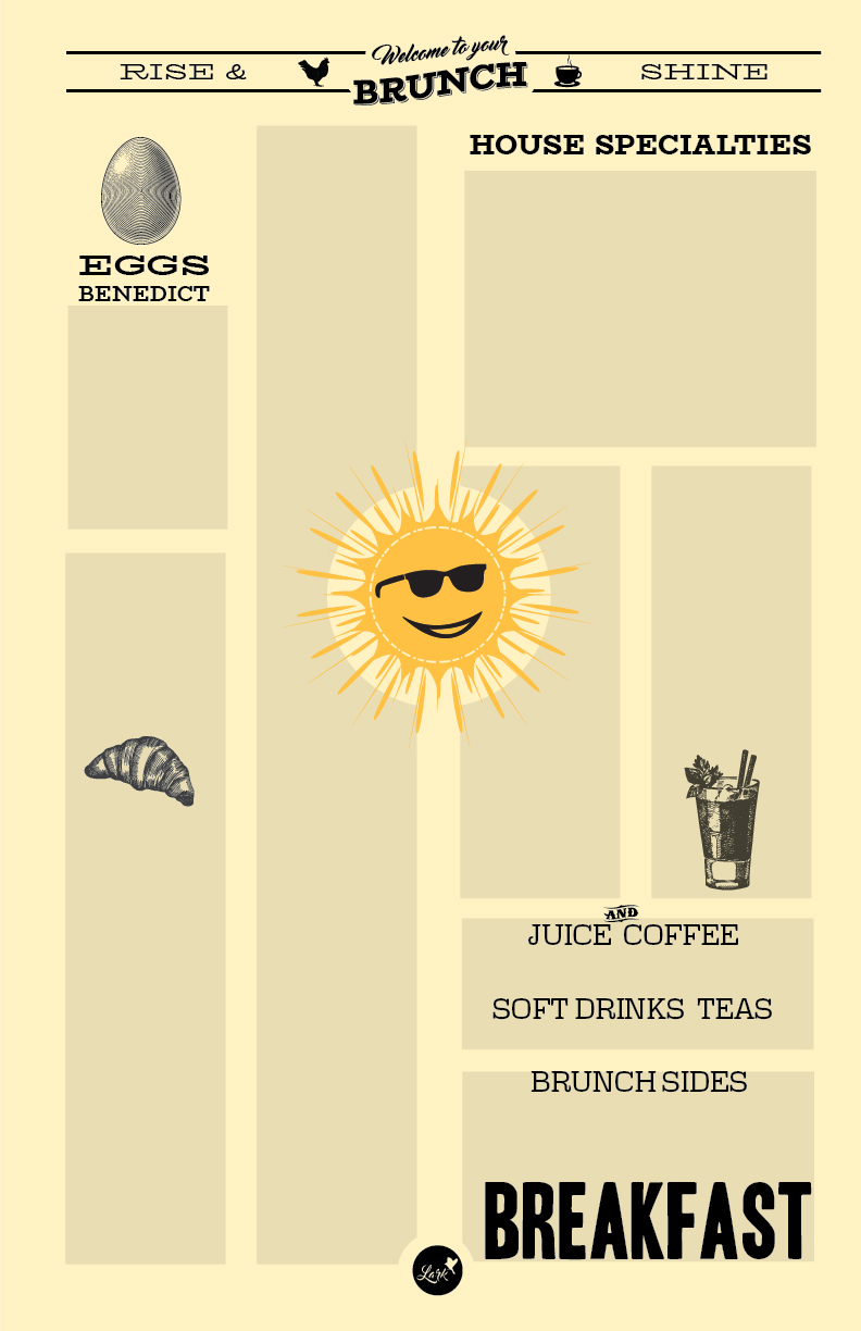
As a key interactive and impactful element for all patrons, the menu needed a major overhaul from both an organizational standpoint and to reinforce the updated visual concept and highlight menu features. A major offering of Lark are it’s wood-fired pizzas, which were lost in both the menu and the restaurant environment. A clipboard concept with multiple papers and sizes, though more complicated in execution, elevated the overall dining experience, food quality/value perception, and is easier for patrons to navigate the many offerings. Their pizza finally got proper billing.
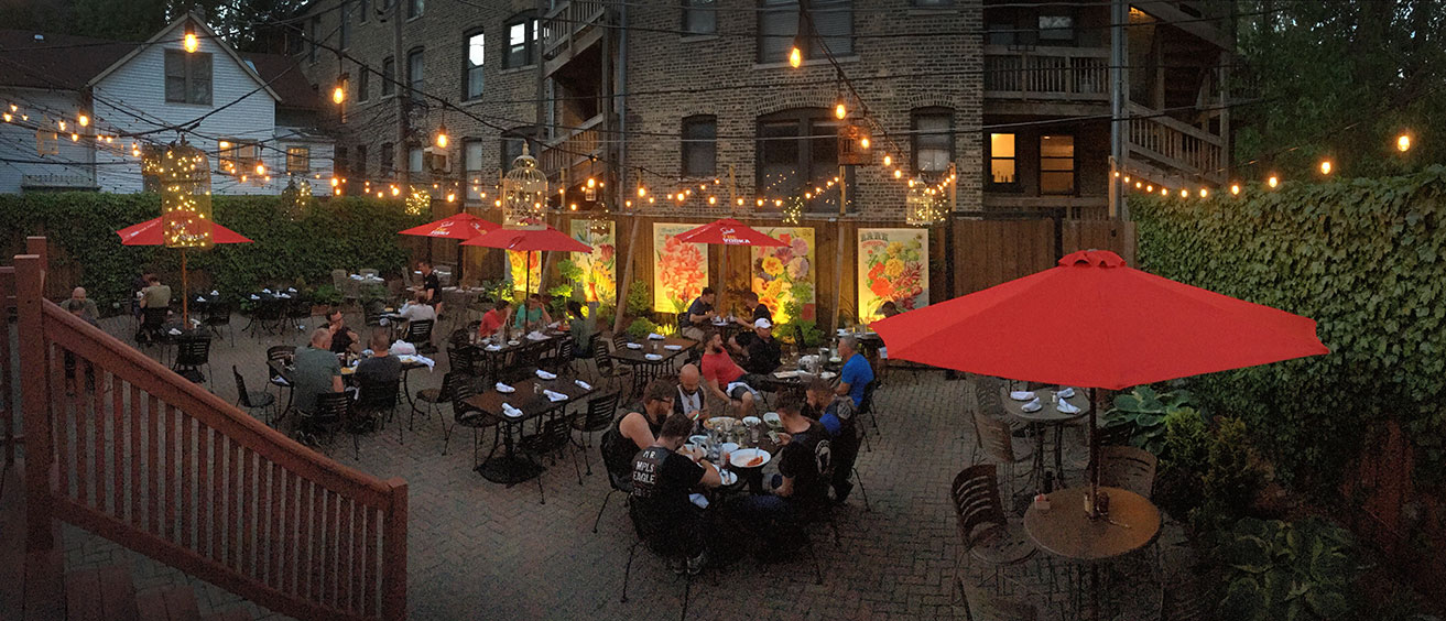
PATIO
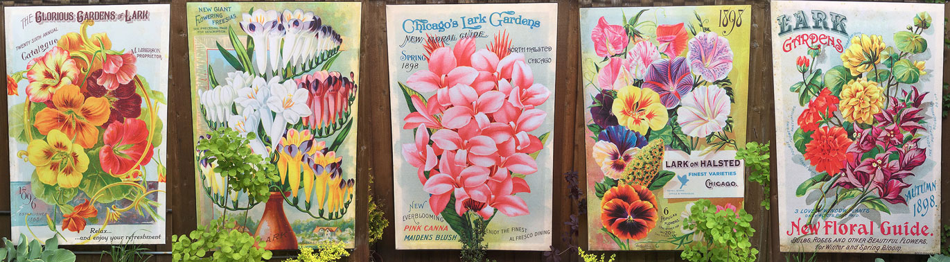
Lark has the largest restaurant patio in the neighborhood, but it needed some attention. Inspiration came from vintage pleasure gardens. Maintaining a vibrant floral garden wasn’t a realistic option, so we created a series of large fabric prints utilizing vintage floral seed packet artwork, ensuring a colorful garden atmosphere, regardless of the current state of the plantlife. We hung internally-illuminated vintage birdcages overhead and installed evening lighting for the prints. We also suggested the exclusive use of liquor sponsor Grey Goose umbrella’s with their more vintage appearance and bird reference.
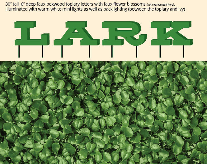
For future enhancement of the space, we proposed a large faux-boxwood topiary installation of LARK letters, in the planter bed along the northern wall of ivy.
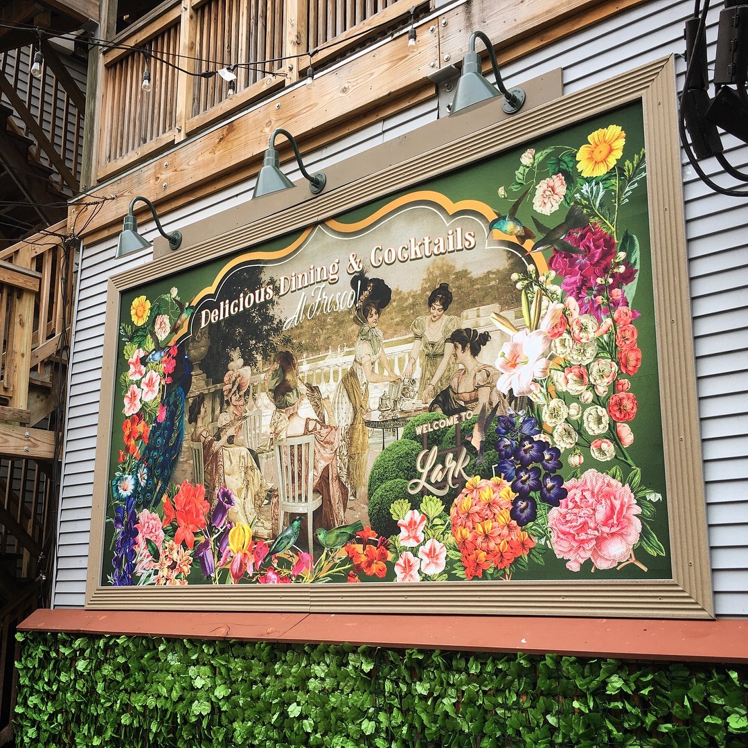
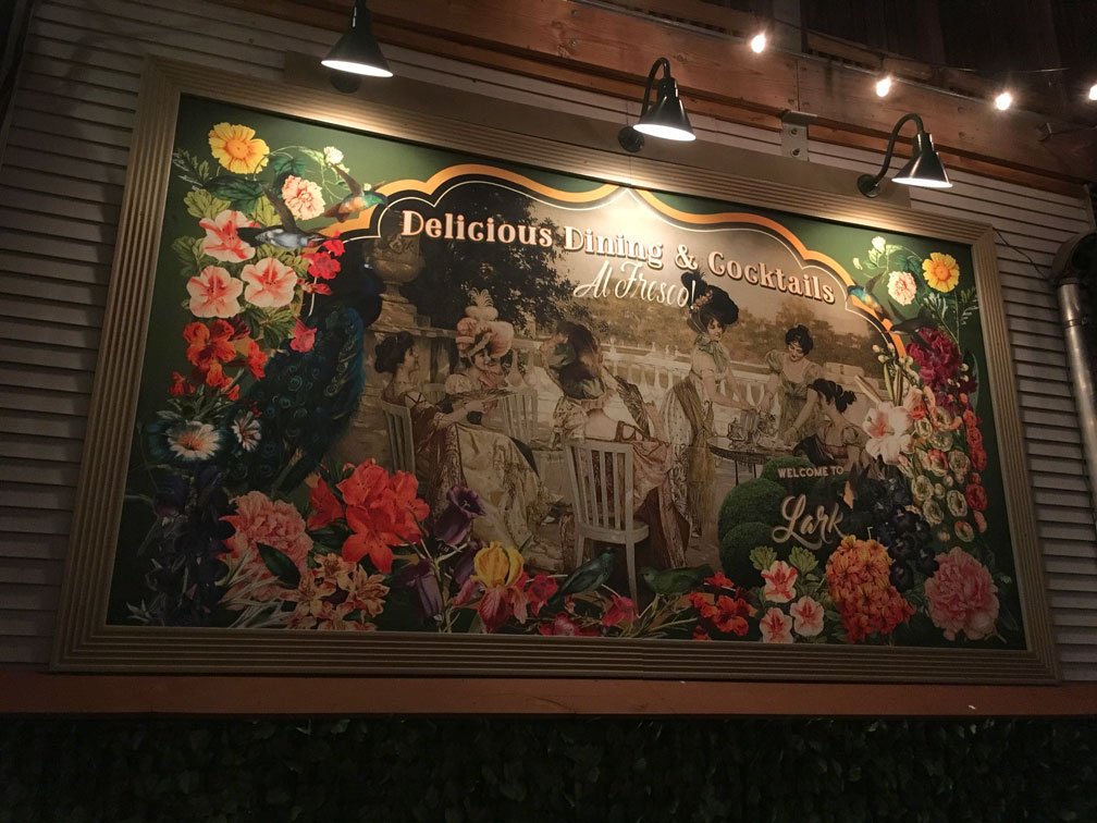
In the spring of 2018, the new owners requested the creation of something for a large gray-sided wall. I suggested an idea we had made to the previous owners of a vintage style billboard to complement the seed packet art and enhance the overall concept of a vintage pleasure garden. The result was very well received.
0 Comments