"It’s hard to measure the impact that having a new logo had on our group’s identity, and our public image, but it's significant. We all immediately fell in love with David’s design. It was simple, fun, and flexible."
-Glamcocks, Burning Man Theme CampGlamcocks Logo Design
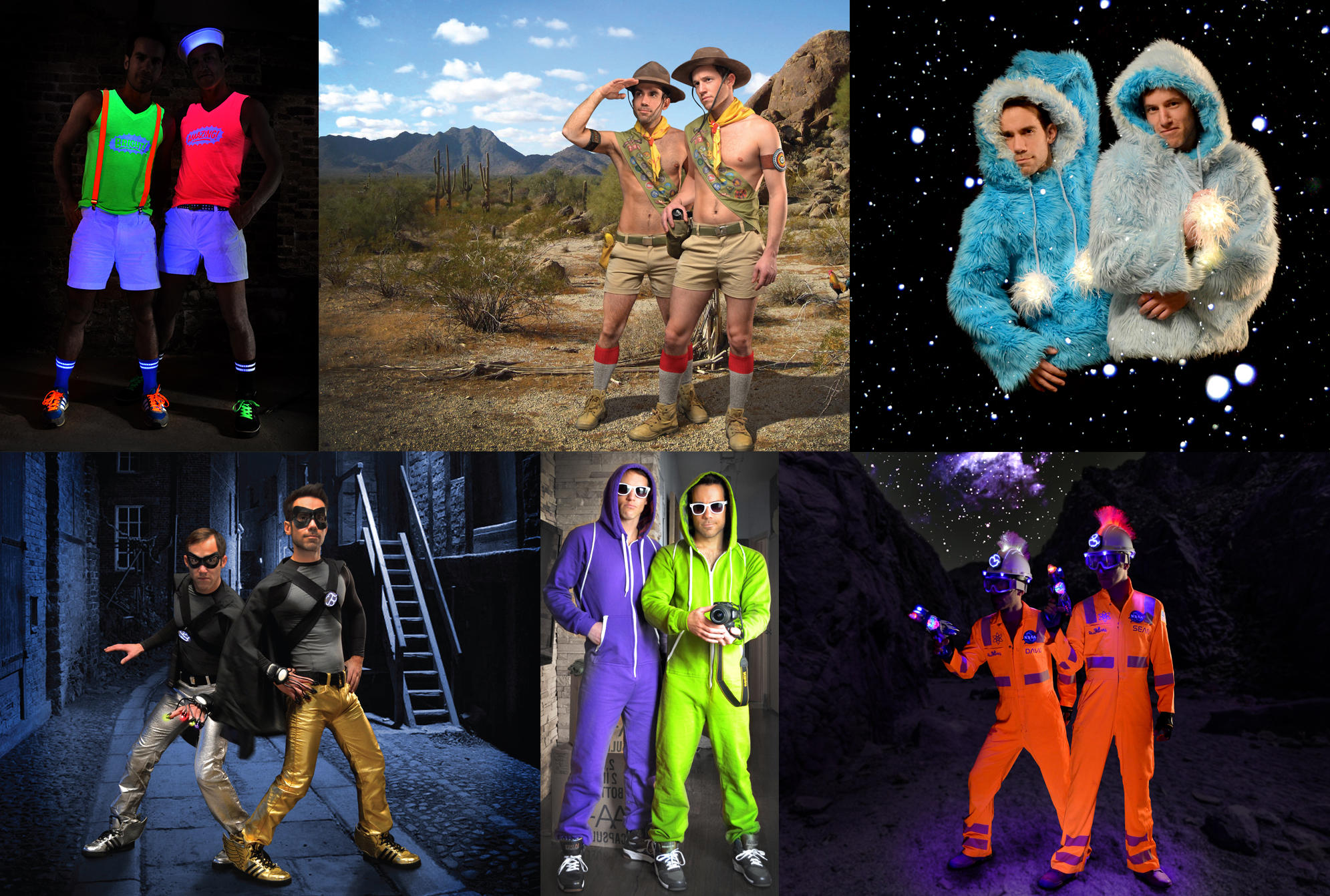
Formed in 2011, the GLAMCOCKS is a theme camp group created for a growing collection of gay men attending the annual Burning Man festival in a Nevada desert. Sean and I were invited to camp with them at our first Burning Man attendance in 2012. As the group had grown significantly and would have it’s first year with official registered status, they wanted a logo. I was happy to have my design selected. I wanted it to be fun, frisky, glam, a hint retro, and gay-but not too stereotypical. It includes a modified rainbow, referencing the gay flag without being so literal. Initial inspiration came from the Hot Wheels logo. I also wanted the logo to be as versatile as possible, to be represented or fabricated in as many ways possible and still read the same, visually. In it’s first year it became a temporary tattoo, steel pendant, t-shirts, a large illuminated sign and more. The Glamcocks continue to grow, thrive and incorporate this branding in new and fun ways. Visit www.glamcocks.com
3 variations on logo construction.
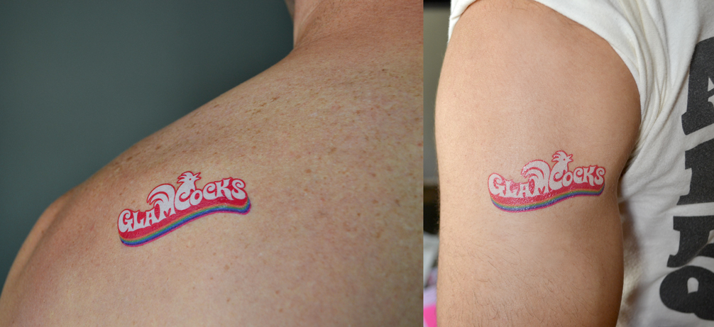
temporary tattoos
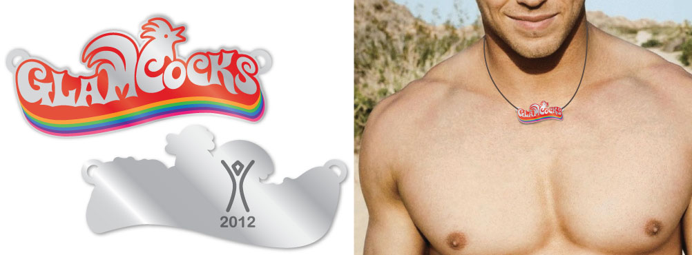
Pendant concept rendering
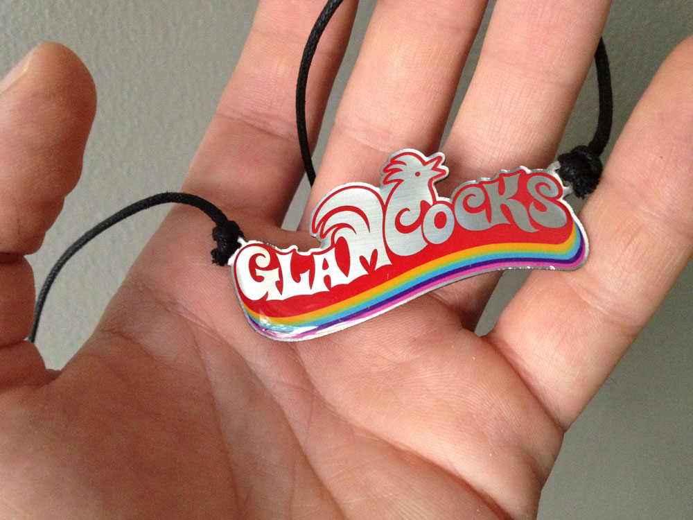
Silk screened and enameled stainless steel pendants.

The flip side commemorated the year with the Burning Man logo.
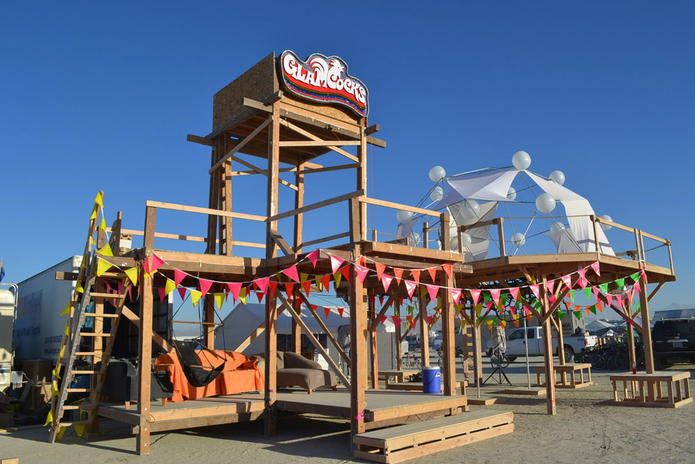
The 2012 Glamcock camp during the day featuring a large illuminated sign made by another camp member.

One of several one-off shirts we produced.
One of several animated logos we loaded onto tiny handheld video projectors we carried with us.
0 Comments